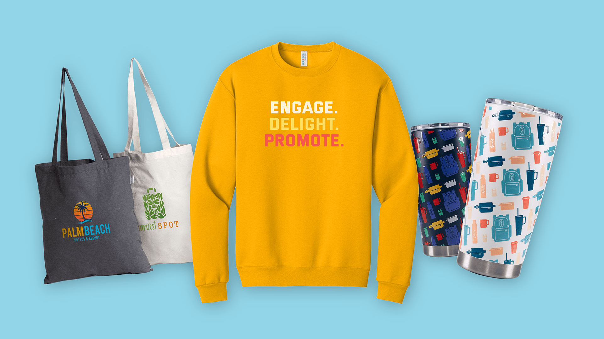
How can you decorate branded merch for your audience so that it feels less like an ADVERTISEMENT? Here are our go-to ways to make your merch look smart!
1) Use debossing on the merch. This makes it less in-your-face. Plus, it’ll have a higher perceived value.
2) Imprint a tagline/saying related to your company INSTEAD of your logo. Adds more personality and is less logo-centric.
3) Tone-on-tone artwork. My favorite example is a glossy black logo on a matte black product. Looks sharp!
4) Put your logo on a zipper pull instead of the actual jacket. Adds a nice touch without taking over the whole garment.
5) Brand the packaging & leave the product without a logo inside! *Ducks because promo purists are throwing tomatoes at me*
6) Personalization. Laser engrave their initials on the product. Make it more about them than you.
7) Imprint your logo on the inside tag of the t-shirts, and utilize the artwork on the shirt itself for something unrelated to your brand.
8) Color-changing products add an extra surprise. Example: Our heat-sensitive color-changing mugs. Your logo magically appears when coffee/tea is poured into the mug!
9) Add decoration to the inside of drinkware, so that you only see it when you are drinking. Makes it fun & unexpected!
10) Decrease the size of the logo. It doesn’t always need to be as big as possible. There, I SAID IT.
If you’ve made it this far I hope you’ve gained at least one valuable idea.
For these ideas and everything else, contact us! Taking your merch to the next level is pretty much what we think about all day long! 😎


