In the promotional products industry, the first instinct is to plaster a logo as large as you can within the given imprint area of the product. But, this isn’t always the most effective route.
Here are a few design tactics you can implement in your promotional product designs to make your brand stand out.
1. Less is More
With promotional products, sometimes there is a small amount of real estate to work with. The main question you should answer is “What are the bare minimum elements I need to include for someone to understand my brand in a quick glance?” You don’t need a phone number, tagline, Instagram handle, website AND company biography. Usually just the logo (and maybe the website) will do the trick.
In most cases, the logo on your design should be prominent, not dominant. Remember: A strong logo will be memorable even at a small size.
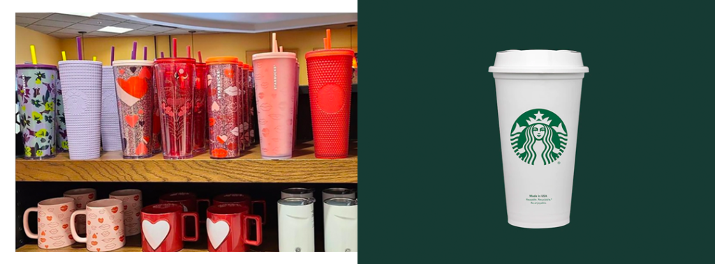
Starbucks does a great job with this. Everyone has seen the classic white Starbucks drink cup and green Siren logo on the side. But when you take a look at the retail space in their coffee shops, you see a variety of design and textures, and in most cases, a discreet, small Starbucks wordmark.
2. White Space
What many don’t realize is that the white (or clear) space surrounding the logo or design is just as important as the logo or design itself. Having breathing room around and within the design helps to keep your message clear, remain balanced, and less aggressive.
Typically, the biggest concern with not making the logo or design as large as possible is that the brand is not being well-represented. This couldn’t be further from the truth! Your logo is NOT your brand. Which brings us to the next point:
3. Brand Design Elements
There is so much more to your brand than a logo. Your company’s personality, services, industry positioning, and values all make up your brand identity. Incorporating design elements that allow these aspects of your brand to shine through makes for an effective and memorable marketing piece.
If you don’t already have additional design elements in your brand guide, here are a few ideas to get started:
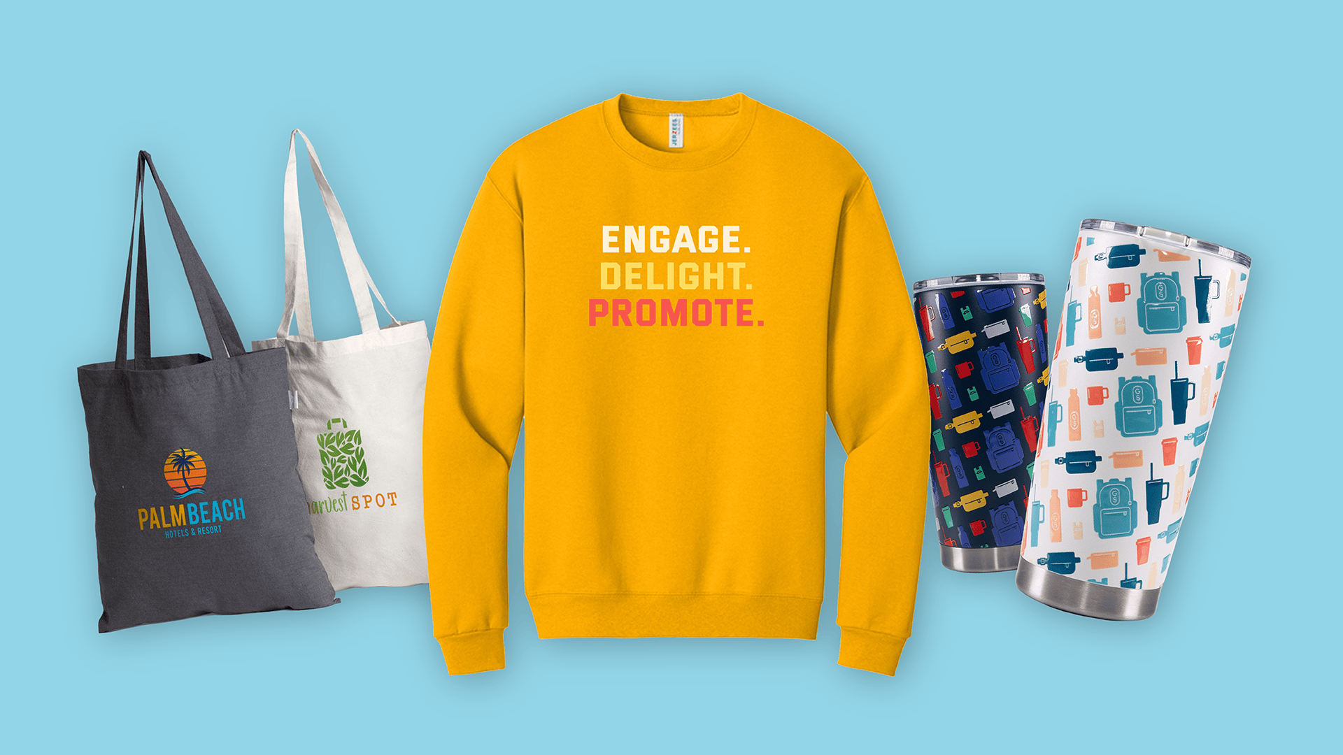
- Design a pattern that works well with your brand. If you don’t know where to start, a repeating pattern of your logo (or parts of your logo) can work!
- Use an online tool like Paletton to create a palette of colors that are complementary to your logo.
- Craft a few catchy taglines that capture your brand voice and personality.
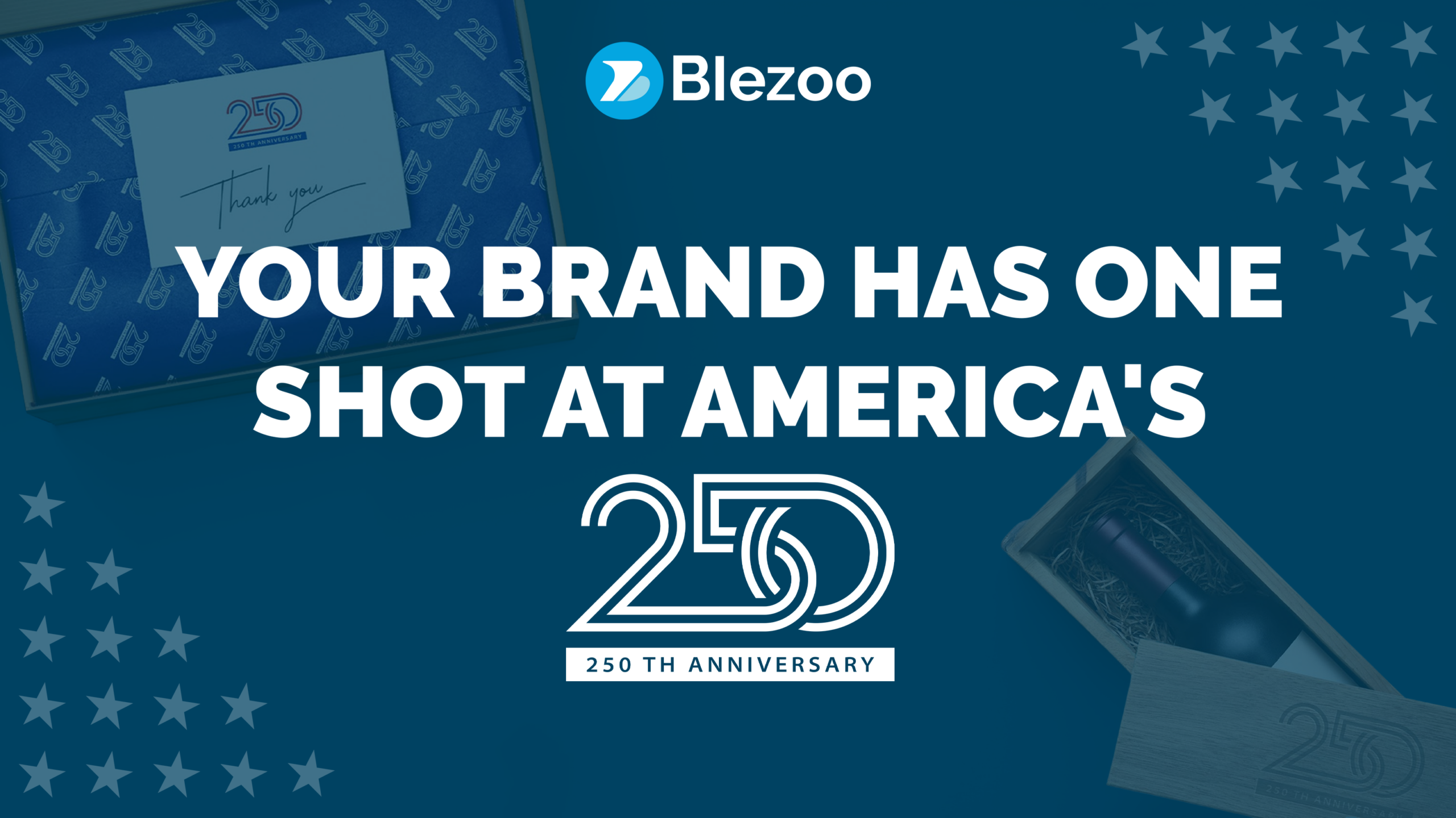
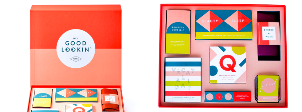
Take a look at this influencer box by Fossil . A strong use of color, shapes, and fun copy instantly illustrates the brand’s personality: Bright, Cheerful, Fun.
Use these design tactics to create effective and memorable promotional products (or Experiences!) for your next project. And if you need a little help on the design side, our in-house design team can help with that. 🎨